
The Challenge
One promise, spread across a whole product line.
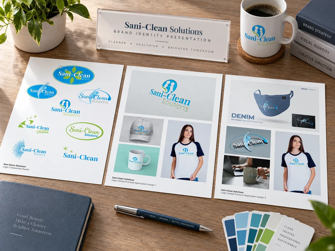
Sani-Clean Solutions trains professional cleaning companies on a certified protection process — and sells a small line of consumer products under the same name, from a face-mask refresher to a non-alcohol hand sanitizer to an automotive odor fogger. Before this project, the mark itself was still in flux, with a dozen logo directions competing for the same shelf space.
The Approach
Pick one mark. Apply it everywhere.
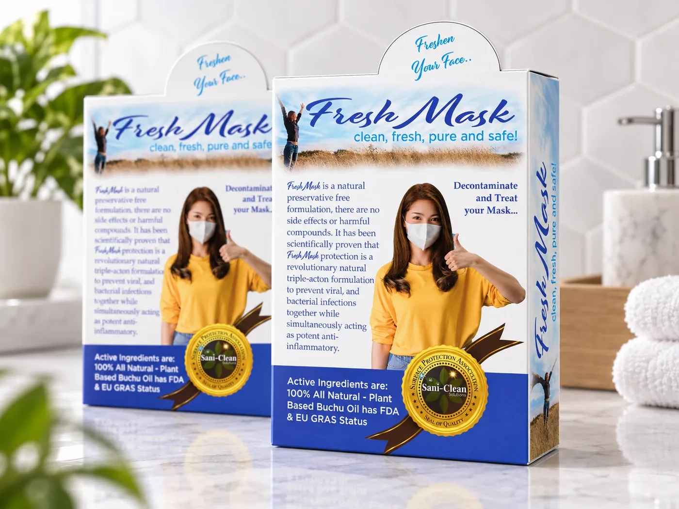
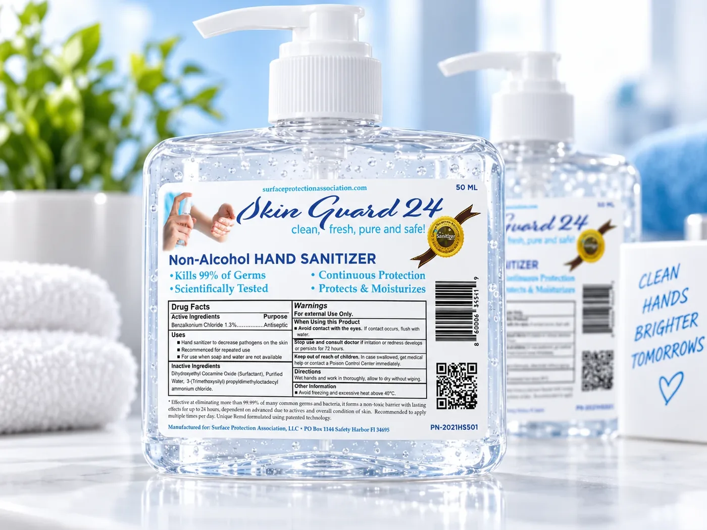
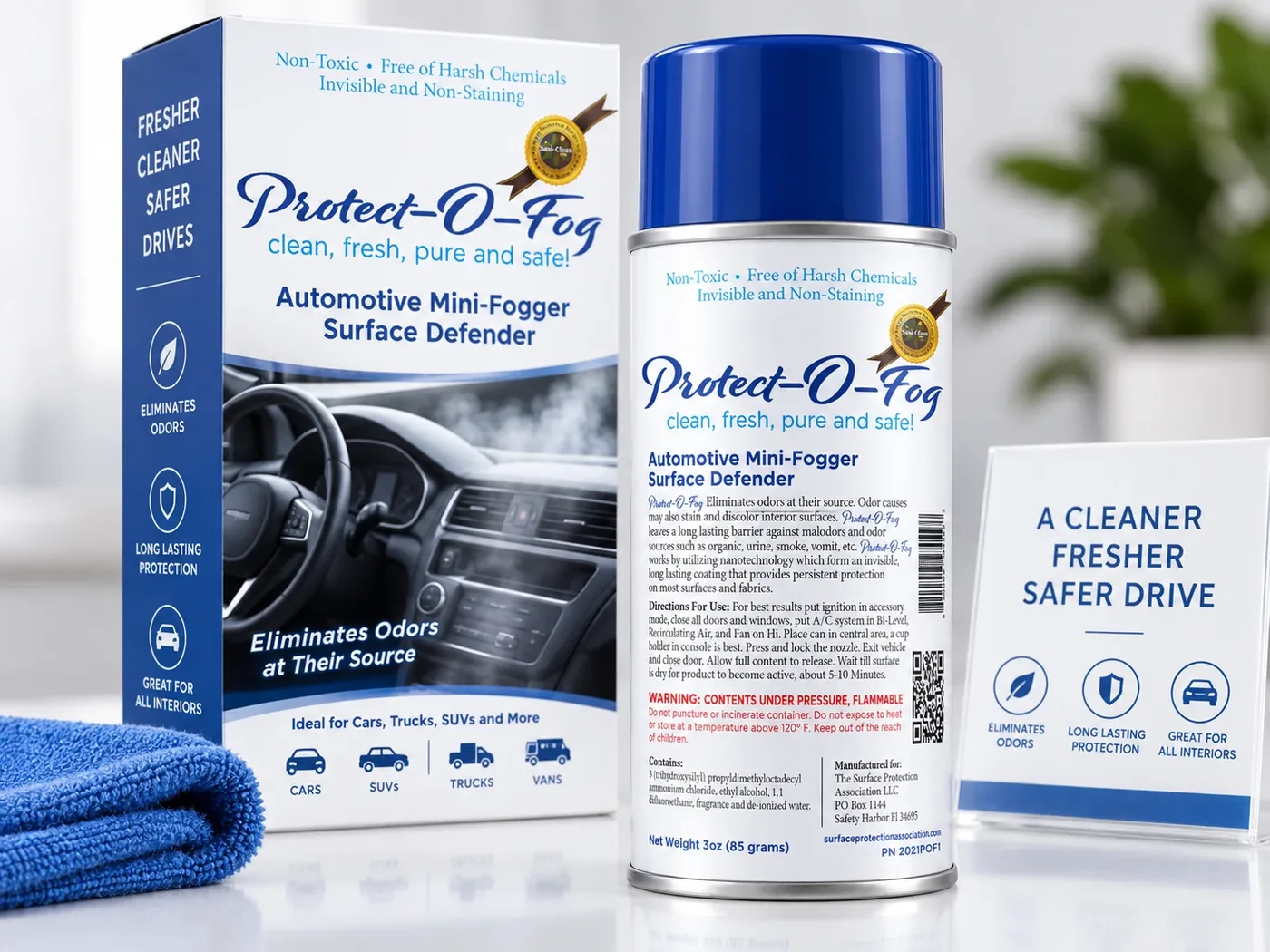
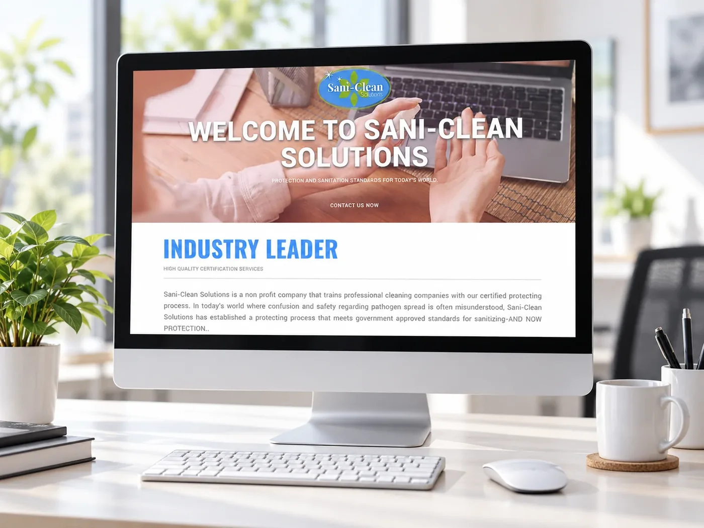
We landed the identity on a single two-figure emblem in Sani-Clean's blue-and-green palette, then carried it across every touchpoint the brand actually ships: Fresh Mask decontamination packaging, Skin Guard 24 sanitizer bottles, Protect-O-Fog automotive canisters, apparel, and a certification website explaining the science in plain language for a non-technical audience.
The Result
A brand that looks the same on a bottle or a browser.
From logo comps to lifestyle apparel mockups to the live website, Sani-Clean Solutions now has one consistent visual language — making a certification-driven, industry-facing company feel approachable to the households it ultimately protects.
“Clean. Trusted. Professional. Sustainable.”Sani-Clean Solutions, Brand Guidelines
Have a project
like this one?
Tell us a bit about it and
we'll help you shape the campaign.
